
Social platforms rarely touch the one thing users see every single time they open the app. That is exactly what Instagram just did.
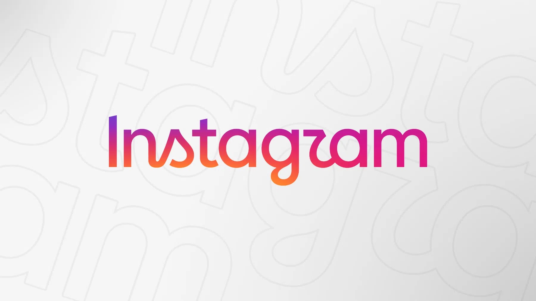
Adam Mosseri, the platform's longtime chief, announced a redesigned wordmark on Instagram on Thursday. The update replaces the lowercase, connected-letter logotype that has sat at the top of the app for roughly a decade.
Mosseri framed the change as modest rather than sweeping. The wordmark's cursive script has always aimed to balance an updated, refined feel with the familiar shape millions of users already know, according to designer Mackey Saturday, who originally built the script in 2013. That balancing act appears to be the guiding logic behind this latest pass, too.
In his post, Mosseri said the wordmark "hasn't changed in 10 years, so it was time for a refresh." He described the new version as cleaner and more modern. He added that it still nods to the original design and to the simplicity Instagram has tried to hold onto since its earliest days.

The new mark keeps the lowercase treatment. Letters remain loosely connected in a script-inspired style. But the shapes are tighter, the curves less ornamental, and the overall silhouette reads faster at small sizes, the size most users actually encounter it at.
Instagram's wordmark has a longer history than most casual users realize. Saturday built the current script style in 2013, replacing an earlier, blockier version. The lettering held through Instagram's 2016 interface overhaul, when the surrounding icon shifted to its now-familiar gradient camera. It also survived a 2022 brand refresh that introduced the Instagram Sans typeface across the rest of the app. Through all of that, the wordmark itself stayed largely untouched. Until now.
Timing matters here. Instagram has spent much of 2026 tightening its product, not reinventing it. The company rolled out a feature letting users swap audio on published posts without losing engagement history. It also introduced Instants, a lighter, unedited photo-sharing format aimed at more spontaneous posting. A quieter, text-only tweak fits that same pattern. Nothing structural changes. The brand just gets sharper edges.
There is also a competitive backdrop. Instagram continues fending off pressure from TikTok on video and from newer, less polished apps on casual sharing. A wordmark refresh will not move that needle directly. But brand consistency across a billion-plus users carries its own weight, and small typographic decisions get scrutinized at that scale.

Mosseri has leaned on personal social posts to announce changes before, from feed behavior tweaks to internal office policy. This wordmark reveal follows that same pattern. Reaction across Threads and Instagram itself was immediate, with users comparing the new lettering side by side with the outgoing version within minutes of the post going up.
No rollout timeline has been confirmed yet. Instagram has not said whether the wordmark change accompanies any other visual updates, or whether it lands globally at once or in stages. Past redesigns, including the 2022 refresh, rolled out gradually over weeks.
Expect something similar here, with the full picture becoming clearer as Instagram documents the change more formally in the coming days.
Check topics and authors from this story to see more stories like this in your personalized feed and receive updates when new work is published.


