For the second consecutive year, the official key art for television's longest-running live-action comedy has ignited an argument about whether anyone can tell the difference between human illustration and machine output anymore.
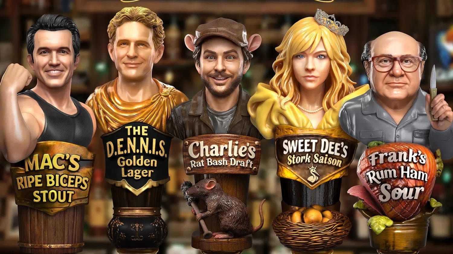
FX set Monday, August 17, for the Season 18 premiere of It's Always Sunny in Philadelphia, returning with an expanded 10-episode order. The poster features the five main cast members as beer tap handles at Paddy's Pub in a hyper-smooth, slightly uncanny digital style. Comments across social media immediately flagged the rendering for visual qualities associated with AI-generated imagery: uncanny facial expressions, uniform lighting, and an overall plastic sheen.
This is not the first time. The reaction echoes what happened almost exactly a year ago with the Season 17 poster, which triggered the same accusations and prompted the actual artist, Michael Kupperman, working with the team at Leroy and Rose, to publicly confirm the work was entirely human-made. Kupperman noted at the time: "We're at an interesting point where the popular backlash against AI imagery will start to cause suspicion against any digital work, or even work that looks digital."
Now it is happening again. FX and Disney have not confirmed or denied how the Season 18 poster was created. A source connected to the show, however, did respond. "The team used the same process for S18 that has been used many times in the past for Sunny art (including S14, S15, S16 and S17… all long before the existence of AI)," the source told Decider.
That may not settle anything. The core problem is structural, not factual. The visual characteristics audiences associate with AI-generated imagery overlap substantially with certain styles of human commercial digital illustration, and human artists working in a high-polish digital style can produce images visually indistinguishable from AI output. Smooth skin, uniform lighting, slight facial wrongness: these markers belong to both categories now.
Disney and its subsidiaries carry baggage here. Marvel's Secret Invasion sparked online backlash in 2023 after director Ali Selim confirmed to Polygon that the opening credits were generated using artificial intelligence. That precedent makes audiences quicker to assume the worst whenever polished promotional art surfaces under the Disney umbrella.
Some fans have theorized the poster could be a deliberate human creation designed to look AI-generated, a meta-commentary consistent with a show that lists workplace automation fallout among its Season 18 storylines. Rob McElhenney and his team have never shied away from provocation. A show built on bad taste leaning into the aesthetics of AI slop would be, at minimum, on-brand.
Season 18 returns with 10 episodes after three consecutive eight-episode runs, continuing the series' record-breaking streak as the longest-running live-action comedy of all time. The announcement also promises celebrity cameos and the return of the McPoyles. Whether the poster was made by a person or a prompt, the conversation has already accomplished one thing every piece of key art is designed to do. People are talking about it.
Check topics and authors from this story to see more stories like this in your personalized feed and receive updates when new work is published.


